Ever seen a red octagon at an intersection and instantly known to hit the brakes? That’s visual communication in action. It’s the art of using images, graphics, and design—instead of just words—to get a message across. You use this powerful, universal language every single day, from the smiling emoji you text a friend to the charts in a business report. It helps us understand the world around us almost instantly.
Seeing Is Understanding: What Visual Communication Really Is

Think of it like this: visual communication is a shortcut. A dense block of text forces your brain to do the heavy lifting of translating words into meaning. A good visual, on the other hand, can deliver that same message in a split second. Our brains are simply wired to process images much, much faster than text.
This isn't some new-age concept. This way of sharing information is as old as humanity itself. The earliest examples we have are cave paintings from over 40,000 years ago in Asia and Europe, which told stories of hunts, rituals, or warnings. Those ancient artists understood something fundamental: showing is often more powerful than telling.
The Building Blocks of Visuals
At its heart, visual communication relies on a few key elements to create meaning. These are the basic tools you use to guide the viewer’s eye, emphasize what's important, and tell a compelling story without saying a word.
Let’s quickly break down the fundamental components that make visuals so effective.
Core Elements of Visual Communication at a Glance
| Element | Primary Function | Everyday Example |
|---|---|---|
| Images & Icons | Provide instant context and recognition. | A shopping cart icon on a website. |
| Color & Contrast | Evoke emotion and draw attention. | A red sale tag in a clothing store. |
| Typography | Convey tone and establish hierarchy. | A newspaper headline in a bold, large font. |
These elements rarely work in isolation. When combined thoughtfully, they create a message that isn't just seen, but also felt and understood on a much deeper level.
The real magic happens when you blend these elements together. You're not just presenting information; you're making it more accessible, engaging, and memorable for everyone.
Getting a handle on these building blocks is the first step. To see how they come together in the real world, you can explore the different visual communication techniques that top companies use to clarify their message and connect with their audience. It's a skill that can completely change how you share ideas.
The Unseen Rules of Powerful Visuals

Ever look at a design and just get it instantly? While another one feels confusing or just plain messy? It’s not an accident. The best visual communication follows a set of unspoken rules—or principles—that create order out of chaos and guide your eyes exactly where they need to go.
When these principles work together, they transform a random collection of images and text into a clear, powerful message.
Think of it like building with LEGOs. You can have all the right bricks, but without a blueprint, you’ll just end up with a colorful pile. These design principles are the blueprint. They’re the invisible architecture that makes everything from a website to an infographic feel intuitive and effective.
Establishing a Clear Visual Hierarchy
The absolute most important principle is visual hierarchy. This is simply the art of arranging things to show what’s most important. Without a clear hierarchy, your audience has no idea where to look first, and your main point gets buried. It’s your way of telling someone, "Start here, then look at this, and finish here."
You can create a strong hierarchy using a few simple tools:
- Size: Bigger things grab more attention. It’s why newspaper headlines are so massive.
- Color: A pop of bright, contrasting color will always stand out from a more muted background. That red "Buy Now" button isn't red by accident.
- Position: We tend to see things at the top or in the center of a page as more important.
When you get the hierarchy right, you control the viewer's journey through your information, making sure they see the most critical stuff first, effortlessly.
"Good design is obvious. Great design is transparent." — Joe Sparano
This quote perfectly captures the goal. When design principles are used well, you don't even notice the design itself. You just notice how easy it is to understand the message. The structure fades into the background, letting the content take center stage.
Creating Balance with Alignment and Contrast
Beyond hierarchy, a couple of other key principles bring stability and focus to a design.
First, there’s alignment. This is all about creating a sharp, organized look by lining elements up along a common edge or center line. It’s the difference between a neatly organized bookshelf and one where books are just shoved in randomly. Good alignment gives your visuals a clean, professional feel and makes them much easier to scan.
Then you have contrast. This is what you use to make certain elements pop. You can create contrast with color (light vs. dark), size (big vs. small), or even fonts (bold vs. regular). Contrast keeps your design from looking flat and boring, and it’s perfect for drawing the eye to a key statistic or call to action.
Of course, for any visual to really work, its colors need to be consistent and accurate. You can learn more about mastering color management in printing to get that part just right. These principles aren't just for graphic designers—anyone can use them to create clearer presentations, better reports, and more compelling visuals.
Turning Complex Data Into Clear Stories
Raw data is just a wall of numbers until you give it a story. Poring over spreadsheets and dense tables can make your eyes glaze over, and the real meaning gets lost in the noise. This is where data visualization steps in.
Think of it as a translation service. It takes the complex, technical language of raw data and turns it into a simple, compelling story anyone can grasp. It’s the art of turning numbers into a narrative.
Charts, graphs, and infographics don’t just present facts; they pull back the curtain to reveal patterns, trends, and connections that were invisible before. A simple line graph can instantly show you a sales trend over the last quarter. A colorful heat map can pinpoint exactly when your website is busiest. Suddenly, the data becomes accessible and, more importantly, actionable.
Choosing the Right Visual for Your Story
The secret to great data visualization is picking the right tool for the job. If you use the wrong type of chart for your data, you'll create more confusion than clarity. It's like trying to explain a song by showing someone a painting.
For example, a bar chart is perfect for comparing different categories, like sales figures across your product line. A pie chart, on the other hand, is best for showing parts of a whole, like how different marketing channels contribute to your overall traffic.
Choosing correctly is the difference between your audience nodding along in understanding and them squinting at the screen, completely lost.
The greatest value of a picture is when it forces us to notice what we never expected to see.
This isn’t a new idea. Using visuals to represent abstract data has been around for centuries. Back in 1644, astronomer Michael Florent Van Langren created what’s believed to be the first statistical graph—a line chart showing different estimates of the distance between two cities. He proved that complicated numerical data could be made intuitive, laying the foundation for everything we do with data visualization today.
Choosing the Right Chart for Your Data
To tell a clear and accurate story, you need to match your data to the right visualization. Here’s a quick guide to some of the most common chart types and where they shine.
| Chart Type | Best Used For | Common Mistake to Avoid |
|---|---|---|
| Bar Chart | Comparing values across different categories. | Using too many bars, which makes the chart cluttered and hard to read. |
| Line Chart | Showing trends and changes over time. | Plotting too many lines on one chart, which creates a "spaghetti graph." |
| Pie Chart | Illustrating parts of a whole (percentages). | Using it for more than 5-6 categories, as slices become too small to compare. |
| Scatter Plot | Revealing the relationship or correlation between two variables. | Assuming correlation equals causation without further analysis. |
| Heat Map | Visualizing the density or intensity of data in a matrix or map. | Using a color scheme that isn't intuitive (e.g., clashing or non-sequential colors). |
Picking the right format ensures your audience immediately gets the point you’re trying to make without having to work for it.
Making Data Memorable and Persuasive
At the end of the day, the goal is to make your information stick. Our brains are hardwired to process and remember visuals far better than text alone. Just look at this breakdown.
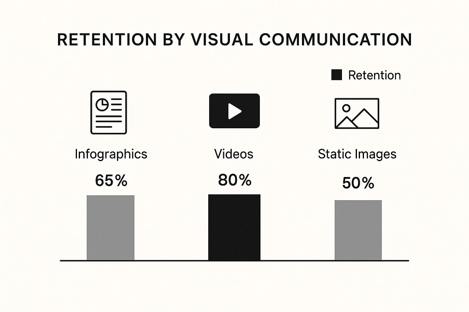
As the graphic shows, more dynamic formats like video can lead to incredible retention rates, making it much easier for people to recall complex information later on.
This is especially critical in the business world. When you're mastering market research methodology, for instance, clear visuals are what turn raw consumer data into a powerful business case. By transforming complex findings into a clear visual story, you can persuade stakeholders and drive real action with confidence.
How Modern Businesses Use Visuals to Win

In the business world, knowing how to communicate visually is like having a secret weapon. It’s not about flashy marketing campaigns or slick ads. The real power is in the day-to-day, where visuals turn complex ideas into something everyone can grasp, driving real results in every department.
Think about project management or HR—visuals are becoming essential for getting things done right. A simple infographic explaining a project timeline is way more effective than a long-winded email chain. It gets everyone on the same page, with a clear understanding of what’s expected of them. This simple shift helps sidestep the miscommunications that lead to expensive delays.
It’s the same story in sales. A well-designed presentation can break down complicated product features into benefits a customer actually cares about. A powerful visual story can often be the one thing that seals the deal.
Boosting Internal Clarity and Alignment
One of the first things you'll notice when you lean into visual communication is how much better your internal teams align. When you present processes and company policies visually, they suddenly become easier for everyone to digest.
For example, HR departments can turn a dense, 20-page policy document into a simple, easy-to-follow flowchart. This approach makes crucial information about company procedures much easier to find, understand, and remember, which means less confusion and better compliance.
The impact here is huge:
- Faster Knowledge Transfer: New hires can get up to speed in a fraction of the time when their onboarding materials are visual and engaging.
- Reduced Misunderstandings: Pictures and diagrams leave far less room for interpretation than text alone, making sure everyone is working from the same playbook.
- Increased Engagement: Let's be honest, people are more likely to pay attention to—and actually remember—information when it’s presented in a clean, visual way.
The core goal is to make information effortless. When a process is visually clear, teams spend less time trying to figure out what to do and more time actually doing it, leading to a direct boost in productivity.
Enhancing the Customer Experience
Visuals aren't just for internal wins; they're absolutely critical for creating a fantastic customer experience. Smart businesses, especially in fields like hospitality, are using visuals more and more to guide and inform their clients. Take, for example, a modern digital guest book for Airbnb hosts, which swaps out dusty, text-heavy binders for clean, visual guides.
This same principle is completely changing the game in customer support. Instead of typing out long, step-by-step instructions to fix a problem, support agents are now showing customers the solution. You can learn more about how companies are using https://blog.screendesk.io/video-customer-support/ to deliver faster, clearer help that builds real loyalty.
By using screen recordings or annotated screenshots to walk a customer through the steps, businesses solve problems faster and leave customers feeling capable and happy. This shift from telling to showing is what sets modern, customer-focused companies apart.
Solving Customer Problems Faster with Visuals
We’ve all been there: tangled in a long, confusing email chain or stuck on a frustrating support call. A customer is trying to explain a technical glitch they can't quite put into words, while a support agent is trying to walk them through a fix they can't see. It’s a recipe for wasted time and mutual defeat.
But what if you could sidestep that entire mess? This is where visual communication flips the script, turning a potential point of friction into a genuine strength for your team.
Instead of just telling a customer what to do, you can show them. That simple change is the secret to resolving issues faster and leaving customers feeling great about the experience. It's all about trading ambiguity for absolute clarity.
From Telling to Showing
Picture a customer wrestling with a tricky settings configuration. A text-only email forces them to decipher a long list of instructions, find the right menus, and hope they don't miss a step. One small mistake and they’re right back where they started, only now they're even more frustrated.
Now, imagine sending them a quick screen recording instead. In under a minute, you can walk them through the exact process, your cursor highlighting every single click. The guesswork is completely gone.
The customer sees exactly what they need to do, making the solution feel simple and intuitive. This isn't just a hunch; studies have shown that visuals can boost learning and recall by up to 400%. That’s why showing a solution is almost always more powerful than just describing it.
Here’s a quick look at how a tool like Screendesk builds this visual-first thinking right into the support workflow.
The whole idea is to make creating and sharing things like screen recordings or annotated screenshots feel effortless for support agents, not like an extra chore.
The Power of Visual Support Tools
Today's best support platforms are designed around this "show, don't tell" principle. They give agents the tools to solve problems with a level of speed and precision that text alone just can't match.
- Annotated Screenshots: A customer can circle an error message on a screenshot and send it over. The agent instantly gets the context they need without a dozen back-and-forth questions.
- Screen Recordings: Agents can whip up quick video guides to demonstrate a process. This is a lifesaver for anything too complicated for a simple written explanation.
- Live Visual Assistance: Some tools even let agents see a customer's screen in real-time, using on-screen pointers to guide them through a fix together. It’s the next best thing to being there in person.
By bringing visual tools into their workflow, support teams can drastically reduce the number of touchpoints needed to close a ticket. This doesn't just improve response times—it frees up agents to focus on the truly complex issues.
This visual-first mindset is key to running an efficient helpdesk. If you want to go deeper, check out these 8 visual support strategies that can make a huge difference in your team's performance.
At the end of the day, solving problems faster with visuals is about more than just hitting your KPIs. It’s about building loyalty by making your customers feel heard, understood, and empowered.
Got Questions? We’ve Got Answers.
Alright, so you’ve got the theory down, but what happens when you try to put it all into practice? Let's tackle some of the common questions that pop up when people start using visual communication in their day-to-day work.
Think of this as the practical, "how-to" part of the conversation.
What's the Real Difference Between Visual Communication and Graphic Design?
This is a great question, and it's easy to get them mixed up. The simplest way to think about it is that visual communication is the 'what' and the 'why,' while graphic design is the 'how.'
Visual communication is the big picture. It’s the strategy behind sending a message with visuals. What are you trying to say? Who are you saying it to? What’s the clearest way to show them? Anyone who’s ever drawn a quick map on a napkin is practicing visual communication.
Graphic design, on the other hand, is the professional craft. It involves specific skills like typography, color theory, and using design software to create visuals that are not just clear, but also polished and aesthetically pleasing. A graphic designer is a specialist in visual communication.
In a nutshell: Visual communication is the goal—getting your point across clearly. Graphic design is one of the specialized methods to achieve that goal with professional polish.
You don’t need to be a designer to be a great visual communicator. That’s the key takeaway here.
How Can I Get Better at This if I'm Not a Designer?
You don't need a design degree to make a huge impact. The secret is to aim for clarity, not for a spot in a modern art museum. Your real goal is simple: make things easy to understand.
Here are a few practical tips to get started:
- Lean on Templates: Don't start from a blank canvas. Tools today come packed with pre-made templates for everything from presentations to reports. They’ve already done the hard design work for you, giving you a solid, professional-looking foundation.
- Stick to One Core Idea: This is huge. Don't try to cram five different points into a single image. Before you create anything, ask yourself: "What is the one thing I need my audience to walk away with?" Then, build your visual around that single, focused message.
- Just Tidy Up: You can make a world of difference by focusing on the basics. Keep elements lined up (alignment) and make sure your most important text or data stands out (contrast). A little bit of organization makes your visuals instantly more effective.
And the best tip of all? Just ask someone. Show your visual to a colleague and say, "What does this tell you?" If they get it right away, you've nailed it.
What Are the Best Tools for Creating Visuals?
The "best" tool is always the one that's right for the job. You wouldn't use a hammer to saw a board, right? The same logic applies here. Figuring out your goal first makes picking the right tool a breeze.
Let's break it down by what you might be trying to accomplish:
| If You're Trying To… | Check Out These Tools | Why They Work Well |
|---|---|---|
| Visualize Data | Tableau, Google Charts | These are workhorses for turning messy spreadsheets into clean, interactive charts and dashboards that actually tell a story. |
| Create Graphics & Presentations | Canva, Visme | These are designed for non-designers. They’re super intuitive and offer massive libraries of templates, icons, and photos. |
| Help Customers & Make Tutorials | Screendesk, Loom | Perfect for creating quick screen recordings and step-by-step visual guides. They let you show a solution, not just talk about it. |
The takeaway is to start with your objective. Are you explaining a complex process, presenting quarterly numbers, or walking a customer through a fix? Once you know that, the right tool becomes obvious.
Ready to stop the endless back-and-forth and solve customer issues faster? Screendesk gives your support team the power to show, not just tell, with simple video tools for clear, effective solutions. See how Screendesk can change your customer support game.